Visual Communication Strategy: Kamloops Arts Council August 13, 2015
BACKGROUND:
The Kamloops Arts Council has a large demographic. They host events pertaining to all art forms including: theatre, music, photography, creative writing, new media, painting, textiles, sculpting and drawing (to name a few). Their audience can range from children to families to adults, and even seniors.
THE CHALLENGE:
In the past, individual events and posters each had their own distinct style. They appealed to event-specific audiences and few people recognized that they were hosted by the same organization. Our job was to create a visual communication strategy to reinforce the KAC brand so that the public would recognize the events as associated.
THE SOLUTION:
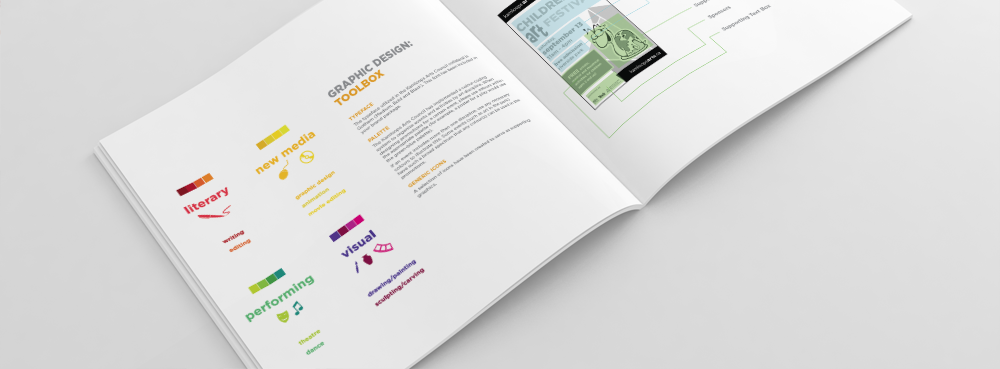
Colour Coding
We introduced a colour spectrum to organize the segments of the arts council. Not only does this visually represent their broad offerings, but it would assist the public in finding what they are looking for faster. For example, if you are only interested in theatre, you know to keep your eye out for the “Lime Green” pieces. If you are interested in Performing Arts, you can watch for the green / blue spectrum.
 Introduction of Shape
We created a simple shape to introduce into the brand materials. This ensured that recognition would not be lost when the colour coding is absent (Black & White / Newspaper printing).
Logo Tweak
The current logo had brand recognition and the organization had existing signage and banners that used the logo. So, it would be unnecessary (and costly) to completely reinvent it. Instead, we approached a brand refresh to introduce the colour spectrum and shape to the existing logo. This reinforced our visual strategy but did not require the organization to replace their current signage and materials.
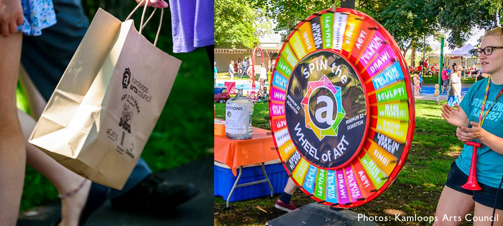
![]() Implementation
Implementation
Because the Kamloops Arts Council has so many events and offerings, they have their own team of designers to create materials. We developed an in-depth Graphic Standards Manual and Brand Strategy Guide to explain the reasoning behind the strategy, how it works, and how to implement it. Virtually any designer can read this guide and create a Kamloops Arts Council piece – meaning all items will have a consistent tone, look and feel.
 THE RESULTS:
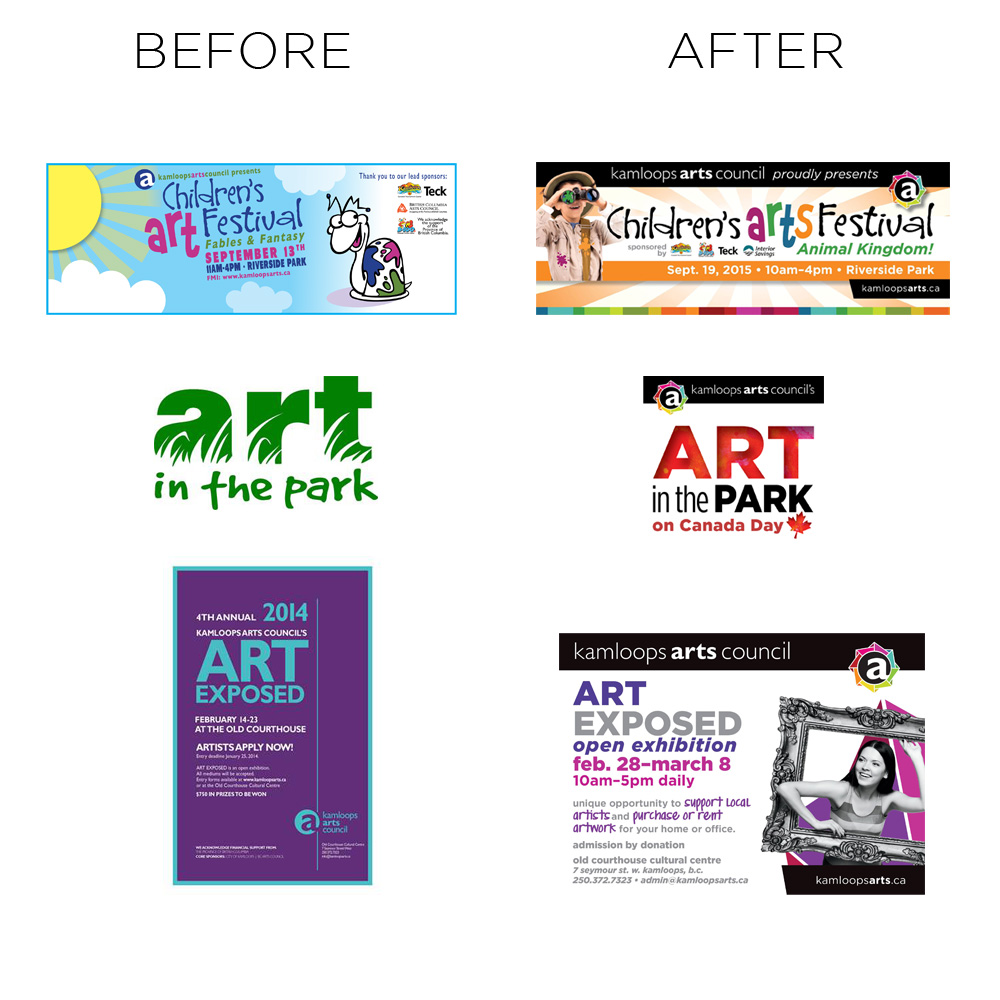
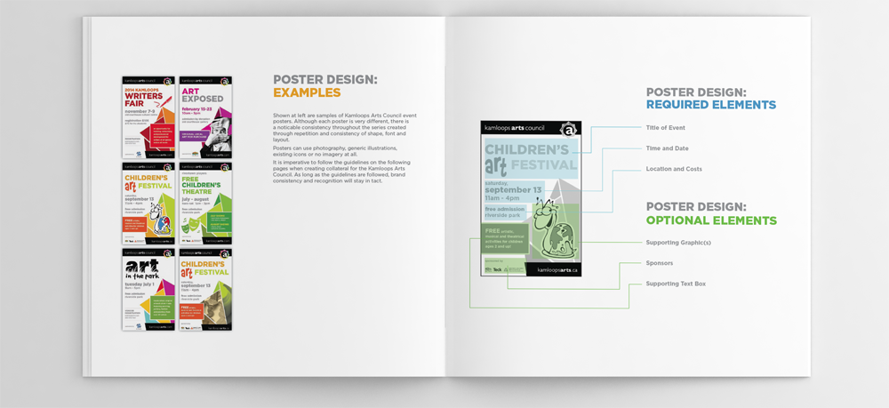
In the examples below, you will see how the events on the left column do not appear related, but the same events on the right column have a unified look and greater emphasis on the Kamloops Arts Council Logo.
All pieces below were designed by the team at the Kamloops Arts Council.
“Fresh Inc. really helped the Kamloops Arts Council (KAC) take things to the next level. Founded in 1968, our organization has gone through extensive growth over the past two years, and while many were familiar with events like Art in the Park on Canada Day, they didn’t know the KAC was behind them. Through a rebrand – which included a creative new take on our logo – the team at Fresh Inc. was able to give our diverse set of events and programs a sense of unity, while maintaining the unique character of each. Above all, our image is now much more professional looking – which has caught the attention of new sponsors, audiences and community partners. Thank you, Fresh Inc.!”
Kathy Sinclair
Executive Director
Kamloops Arts Council