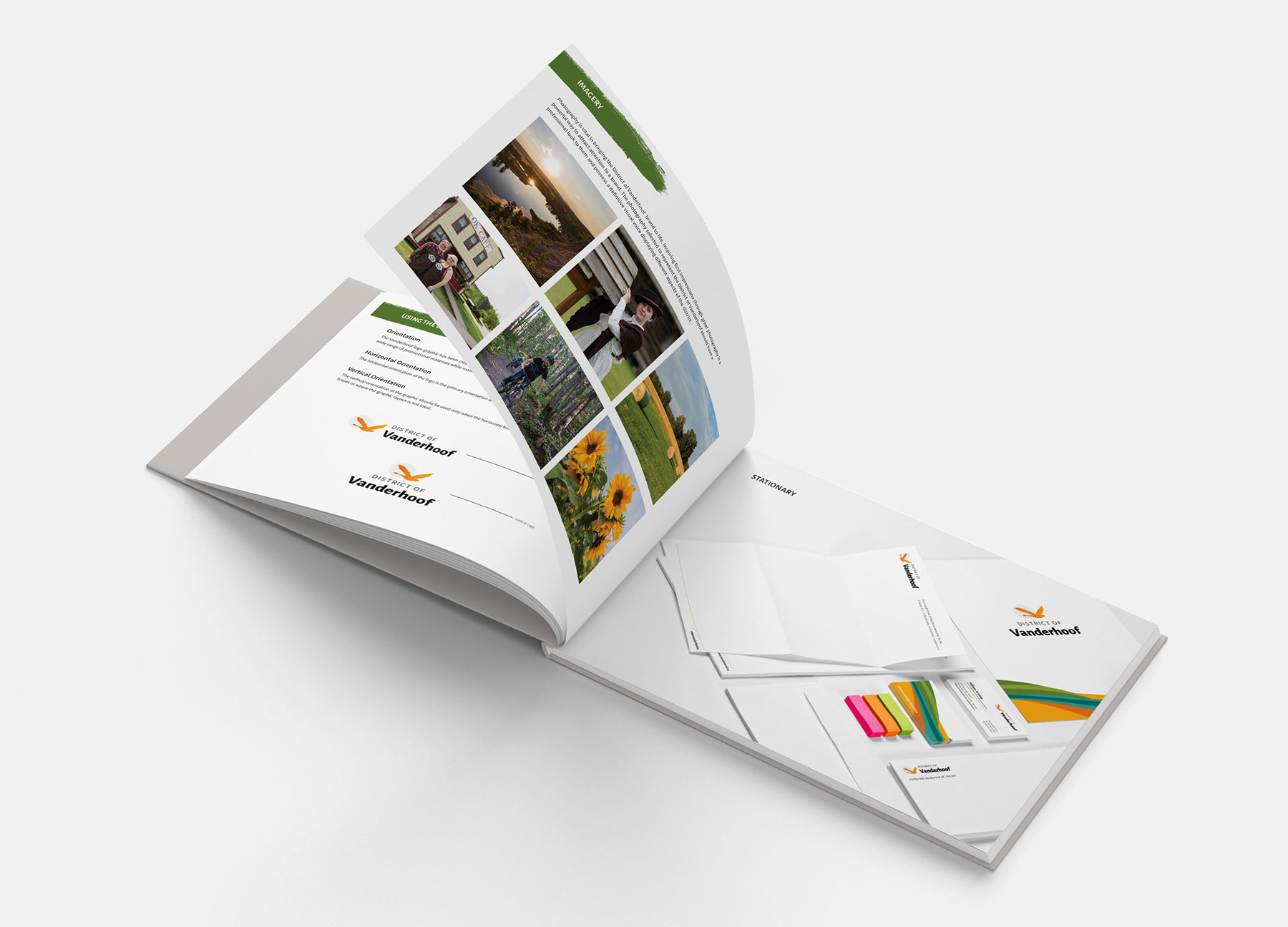
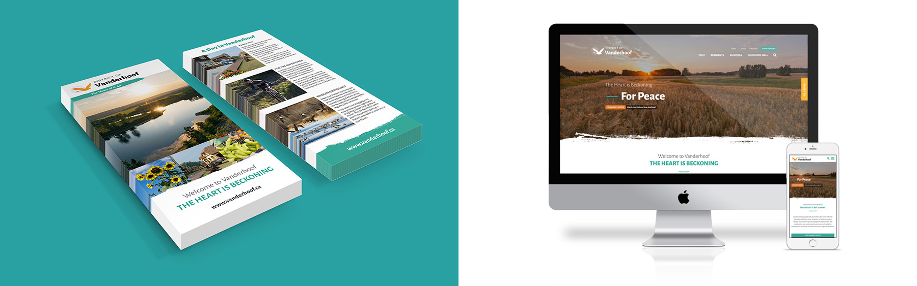
The City of Vanderhoof, sought a complete brand transformation to reposition itself as a thriving and welcoming community. In collaboration with local stakeholders, our team crafted a comprehensive brand package, beginning with transforming the original logo into a more modern and visually appealing version of itself but in keeping with the city’s heritage. This logo was integrated into a cohesive brand package that included color schemes, typography, and brand guidelines. A tailored visual strategy showcased Vanderhoof's natural beauty, cultural diversity, and economic vibrancy, while a user-friendly website design provided a central hub for residents and potential newcomers. The result was a successful rebranding effort that revitalized the city's image, attracting new residents, businesses, and tourists, and instilling a sense of pride in the community.


Made in Canada - © 2026 Fresh Brand Marketing - All Rights Reserved.