Logo Refresh vs. Rebranding September 1, 2015
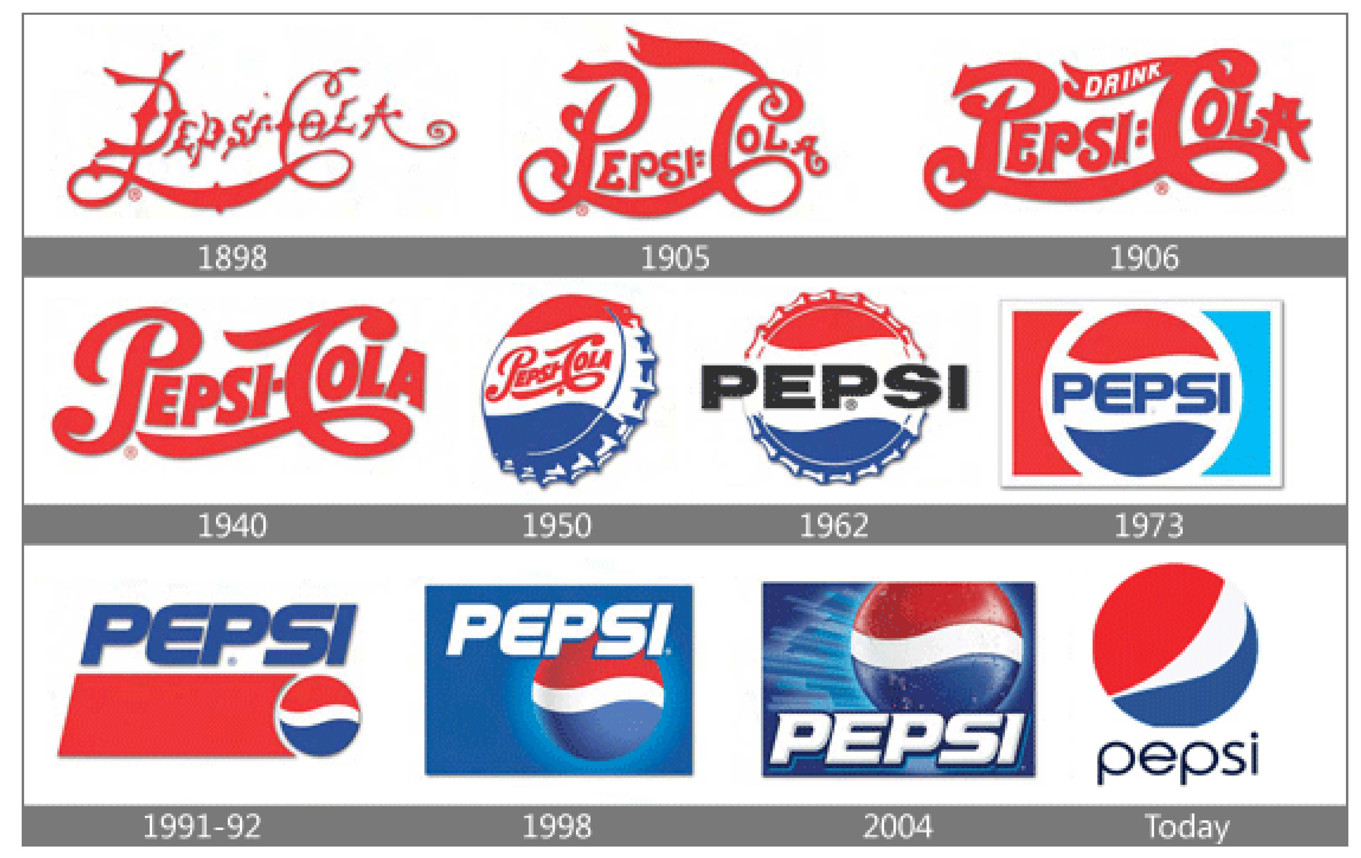
Even the greatest, most expensive logos have had a refresh or rebrand at least once. Do you think Pepsi would have the same success if they were still partying like it’s 1898?
SOURCE: http://www.risingabovethenoise.com/how-to-rebrand-19-questions-ask-before-you-start/
“My logo works perfectly fine. Why should I change it?”
The fact is, brands need to evolve. Technology advances. Generations age. It’s important to keep an objective perspective on how your company is perceived and whether or not it’s still relevant. Like a haircut that was awesome in the 1980s: you might think it still looks good, but if you ask a stranger they will be the first to tell you it’s time for a makeover.
LOGO REFRESH OR REBRAND?
If you have a well-known brand, such as Pepsi, a brand refresh is all it takes. Brand refreshes, when done properly, can often go unnoticed by the average consumer. It usually incorporates the same existing elements (colour, shape, fonts) but with minor modifications.
If your logo is dated, incorporates obsolete icons or has no existing resonance with your audience, it’s best to start with a clean slate.
LOGO REFRESH
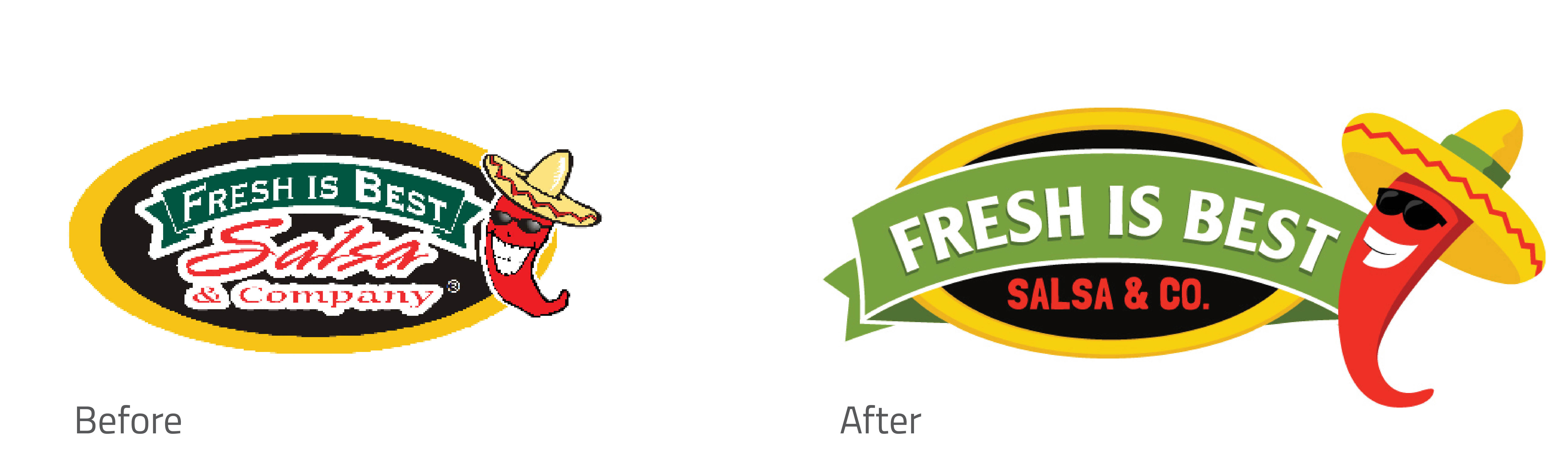
The Fresh is Best Salsa & Co. logo refresh improves legibility and introduces updated fonts. It was important to retain the same general elements because this company had a good reputation and existing customers would look for the black bag with the yellow oval on it. If we were to drastically change the colours and shapes, the customers would be confused and alarmed.
The subtle change allowed F.I.B. to roll out the brand gradually. There is no “Grand Opening” for a logo refresh; it just appears over time. (Think about how many old Pepsi trucks and vending machines are still around!)
This is the most cost-effective route, as packaging and signage can be changed as it needs replaced and there is very little waste.
REBRAND
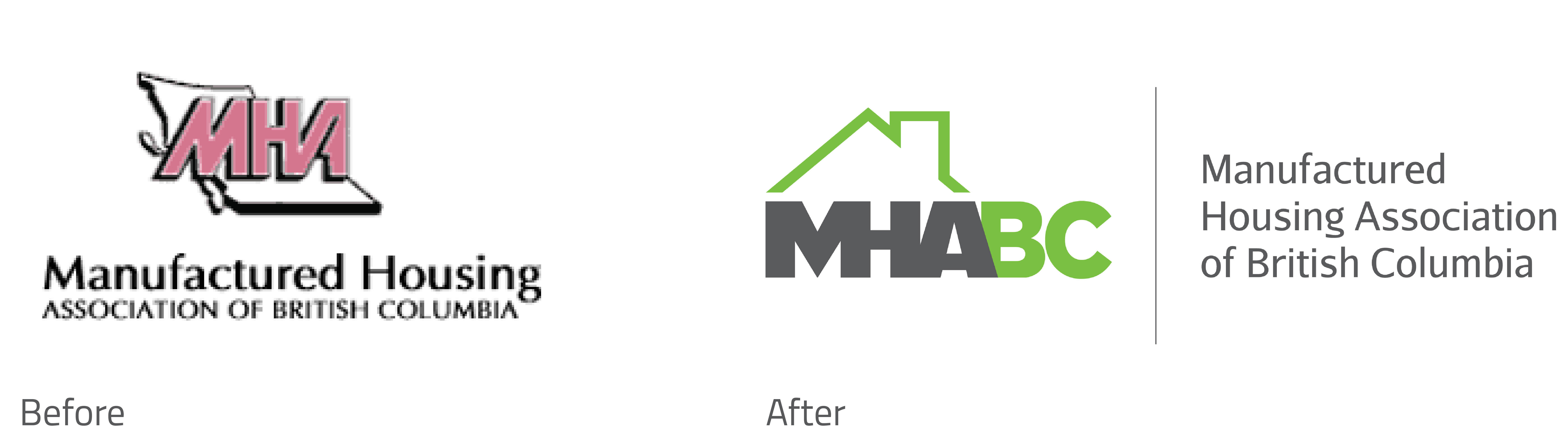
The Manufactured Housing Association of BC (MHABC) did not have existing loyalty or recognition to their original logo. After extensive research, we recommended a “clean slate” re-brand, meaning new colours, fonts and icons. Since it pertains to housing, we felt a simple house/roof icon would be more resonant than the previous icon of the province of BC. The colour green has subliminal “eco-friendly” messaging, which strongly applies to the MHABC’s mandate. And lastly, a bold, legible font as a stand-alone element makes the logo more versatile so that it can be used with or without the supporting text on the right.
Contact our branding team for more information and examples of our work!