Statistics & Chart Design October 17, 2016
When using statistics in advertising or annual reports, it is important to remain ethical and unbiased. Your job is to present the facts, and we have compiled some pointers for successful chart design:
DISPLAYING STATISTICS
3 OUT OF 4 IS NOT 75%. If you ask 4 dentists to try your toothpaste and 3 of them like it, that is not enough basis to say that 75% of dentists like your toothpaste. Percent means “out of 100” which means you need to base your “percent” statistics out of at least 100.
ALLOW FOR A MARGIN OF ERROR/DISAGREEMENT
While it is perfectly acceptable to make a claim such as “3 out of 4 Dentists…” it is still important to remain ethical and realistic. If you happen to select 4 dentists who all approve of your toothpaste, be prepared to face some backlash if you say “4 out of 4 Dentists Recommend!” It’s natural for a human to associate 4/4 as 100% and there is always at least one person who goes against the flow!
One way to avoid misconception is to include a disclaimer or show transparency in your wording:
“We visited the Kentucky College of Dentists on Halloween Day and gave free samples of CLEANSMILE® toothpaste to the first 4 students on campus. When asked if they would be using CLEANSMILE toothpaste that evening, 4 out of 4 of them said yes!”
USER-FRIENDLY CHART DESIGN
3 out of 4 designers love bakery-themed charts. The pie chart is the most common, and its lesser known sibling is the donut chart. They seem pretty similar, right?
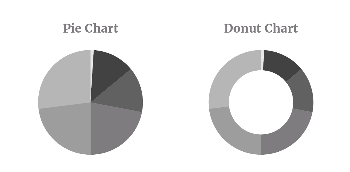
In fact, the pie chart is considered to be the most user-friendly of the pair, and therefore ethical for displaying information. This is because it shows the wedges meeting in the centre and this intersection is the best place for a viewer to compare the proportions of each wedge side-by-side. If you’re not placing the percentage values on the chart itself, you must ensure you are using a pie chart design and not a donut chart design!
Let’s go a step further on the pie chart: To achieve the best retention of your statistics, order the wedges sequentially as opposed to jumping from number to number.
Do this order: 5, 8, 37, 50
Don’t do this order: 8, 50, 37, 5
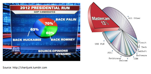
AVOID “CHART JUNK”
“The interior decoration of graphics generates a lot of ink that does not tell the viewer anything new. The purpose of decoration varies — to make the graphic appear more scientific and precise, to enliven the display, to give the designer an opportunity to exercise artistic skills. Regardless of its cause, it is all non-data-ink or redundant data-ink, and it is often chartjunk.”
–Edward Tufte, The Visual Display of Quantitative Information
Successful information design is not defined by beauty; it is defined by whether or not the audience found what they were looking for clearly and concisely. As such, your chart’s success is not measured by how nice it looks, but whether or not it properly displays the facts.
Although you may have the best intentions for your audience, you may accidentally be swaying the statistics.
Designer: “Another pie chart? BORING! Let’s make it 3D.”
Audience: “The wedges appearing ‘closer to me’ in this 3D graph appear to be the largest. I will ignore the others because they aren’t as important.”
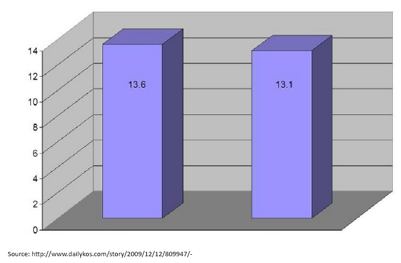
This bar graph is considered hard to read because of it’s 3-D effect. A flat bar graph with the values placed side-by-side would be more legible, and when values are in smaller increments, it is easier to notice the subtle difference between 13.6 and 13.1. If the bars were to be placed side-by-side, you would also be able to discern the difference.
CONCLUSION
Start with the statistics and make sure you aren’t accidentally assuming that 4/4 = 100%.
Find a happy medium between a Tufte chart and an attractive design that matches your brand. Not all graphic elements are evil, in fact, sometimes they can help. In the example below, a subtle grid was added to help you to compare values in relation to the grid.
(source: 2016 New Life Community Impact Report, Fresh Inc.)
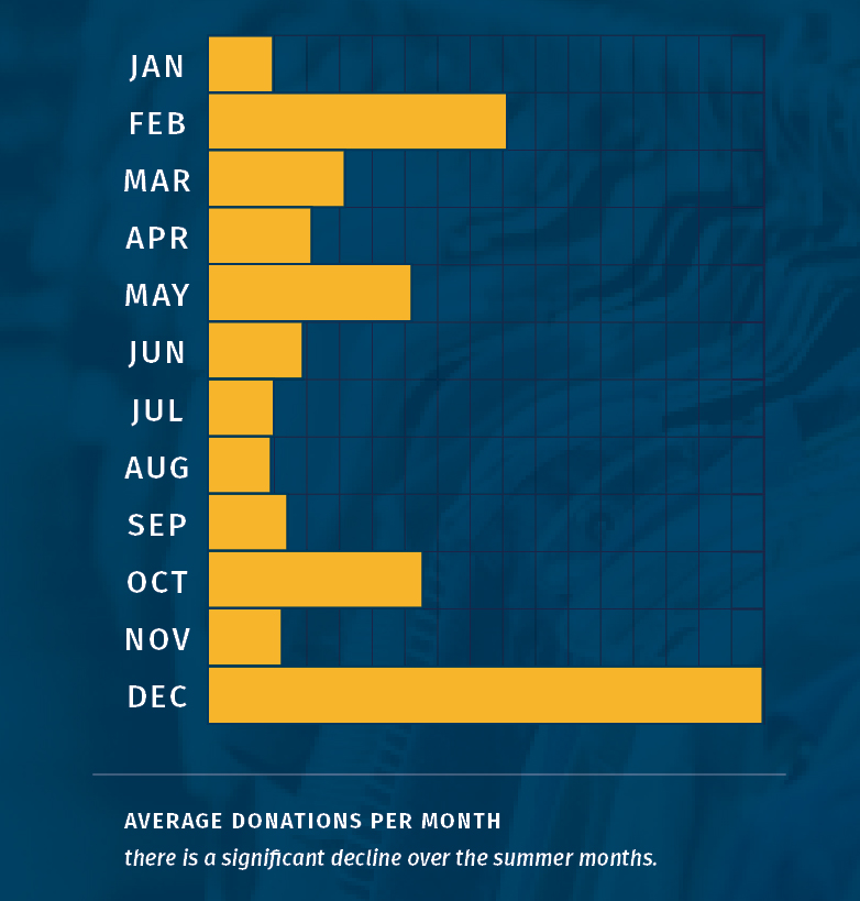
A successful example of chart design, this bar graph displays statistics over the course of 1 year.
RESOURCES
Info Design 101 (Webinar) Iffat Jokhio RGD. http://www.rgd.ca/database/files/library/InfoDes101_ij_presentation.pdf
The Visual Display of Quantitative Information Edward Tufte