Visual Strategics – What is it? May 1, 2017
VISUAL INFORMATION
Visual information is received from all that surrounds us. From the people who cross our paths, the environment in which we live in that guides and directs our behaviour, to the language in which is presented before us and opened for interpretation.
VISUAL STRATEGY
Creating a visual strategy provides the basic foundations or first impressions as to how your customers will interpret your business. There are so many elements that needs to be considered based on the types of consumers you are targeting such as colour, typefaces, and imagery which are used.
HOW ARE VISUAL STRATEGIES MEASURED?
A visual strategy for your business will often involve processes such as competitor research, choice boards and feedback tools such as user end user scenarios and statistics to help gauge the impact of your product towards the customer you are targeting. By doing so, you will be able to effectively identify gaps in your business plan and develop a campaign that will be well received by your audience. Once you have a visual strategy prepared, the next phase is consumer testing.
Businesses will utilize these targeted consumer testing groups to assist in measuring their visual strategy by exposing it to their targeted audience. It allows them to get a sneak peek into how their brand will be welcomed and perceived before investing a lot of money into marketing and promotional materials. Many companies have to consider and justify the costs spent on advertising therefore its essential to identify and define what exactly you’re investing in before getting in too deep.
“Visual strategy could be best described as prioritizing the way you want your brand to be received by others. This often includes the type of font, choice of colours used within your brand – what mood do these colours convey? The images and graphical elements presented thoughout – do they stimulate the desired behaviour in your targeted audience – and is it recognizable?”
WHAT SETS YOU APART – COMPETITOR ANALYSIS
When defining your visual strategy, it is important to take into consideration what strategies your competitors are performing. You have to ask yourself: How effective are their campaigns and how do you stand out next to them? What are your key differentiators that will set you apart?
Let’s use Canadian telephone companies as our example. With each offering a service that is inherently the same, how can they make themselves stand out if they are all going after the same audience? How do they separate themselves?
In this example I will use some examples from major telephone companies. Coming from a big city like Toronto, I was bombarded by advertising all around me. What I found interesting when looking at these see of advertisements was how each one stood out. Why they stood out. Analyzing how it made me feel looking at it and the emotions they conveyed.
BELL CANADA
Where you advertise is just as important as the advertisement itself. The ad you see below anyone who doesn’t have exposure to public transportation may have a different perception to the ad presented than someone like myself coming out of Toronto. You have to be cautious and not assume that everyone is going to understand your brand or the message you are sending which is why consumer testing is so important.
For someone like myself, I see 3 people who are riding the subway or bus standing holding onto the rail extenders above them which prevent them from falling during braking. I see that they are able to multi-task and commute which is important to a city slicker. In this ad they cover 3 demographics of people which can be found riding city transit which in turns widens their audience appeal.
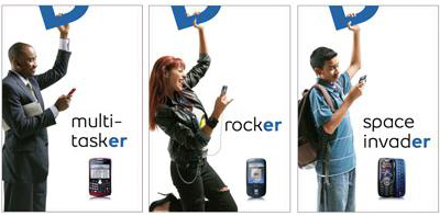
Bell Canada’s branding strategy allows them to remove their name completely from their advertising yet still become a recognizable brand. How did they do it? Well, Bell has a unique font which is easily recognizable, are known for blue white and black advertising, the abstract usage of dimension and white space. The consumer collects all this data information subconsciously and immediately – without knowing the name of the company, safely assumes this is indeed an ad by Bell. Consistency is key when developing an identifiable visual strategy for your business.
KOODO
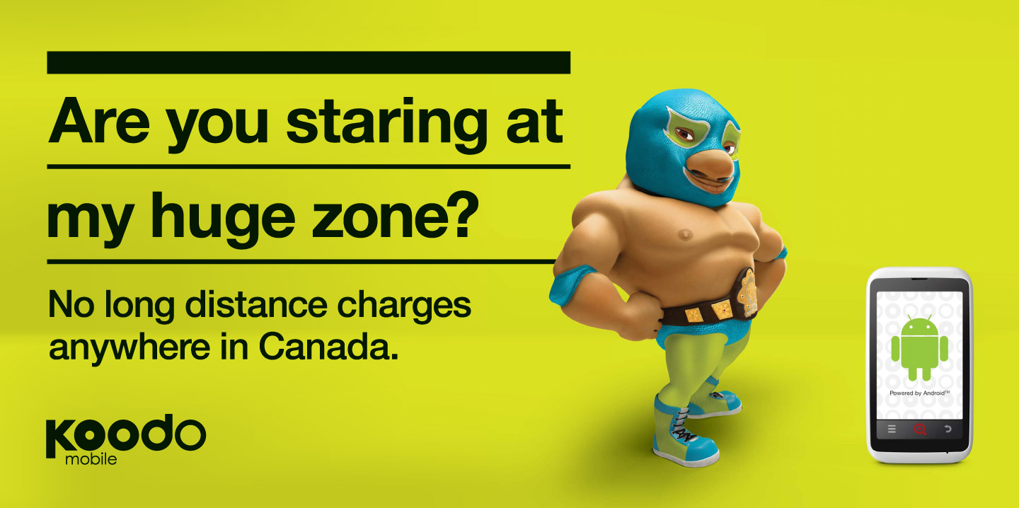
Koodo is another company known for their usage of white space, distinguishable font (typeface) as well as known for their bright usage of florescent colours and sense of humour. When it comes to imagery presented they can use their signature mascot or their flash back to the 80’s (of course targeting those who remember the 80’s), they get their message across quickly before anyone even begins reading. Again, in a world full of letters fighting to get your attention to read their message, Koodo and their off the wall approach (never knowing what they are going to say) method of advertising makes the consumer want to read it.
DEFINING YOUR OWN VISUAL IDENTITY
When you think about your visual strategy, you need to think of the key words you want your consumers to interpret when they look at your brand.
Look at these typefaces and colour pallets below. What does each one say to you about a product? Does one style of font appear more appropriate than the other? What does the colour say to you? Does the style and colour seem cohesive? Think of the first bit of messaging that comes into your mind when looking at the following and write them down.

These next few logos are brands which actually exist but all cater to a different consumer base demographic. Using the same exercise as above, write down the first words you think of when you look at these. There are no right or wrong answers – but merely an observation to look a little deeper at what we see as consumers ourselves.
![]() COMPETITOR RESEARCH
COMPETITOR RESEARCH
These next four examples are all jewelry providers. What does each one say about the product based purely on their brand? What do you know about their brand just from the name? If you are performing competitor research and you are a jeweler wanting to open your own company, you will need to figure out where your product lines up; this way you can begin to consider your visual strategy that will help identify your product among the competition. Which of these logos feel prestigious? Does the colours evoke emotion? Does the font match the brand?
![]()
WE DO THAT!
When you come to Fresh Inc., you are getting more than just a brand you are getting the whole visual strategy and the market research to back up your band. We perform extensive research into the competition to create a brand that’s right for you and that will help you stand apart from the crowd. If you already have an existing logo, we offer brand audits to establish the extent to which your brand should be revised. Through market testing we can assemble field tests within your targeted demographic to help hone in on a strategy that works for you. The results of market testing has proven to be an excellent resource of information based on raw honest feedback from the community in which you are targeting, and establish a brand welcomed by your consumers.